ShopDreamUp AI ArtDreamUp

Deviation Actions


Suggested Deviants


Suggested Collections


You Might Like…


Featured in Groups
Description
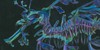
Colored version of [link] I might use it as my avatar, I finally have one made by myself. ")
(You are not allowed to use this as your avatar!)
(You are not allowed to use this as your avatar!)
Image size
283x283px 885.62 KB
© 2012 - 2024 BlueIrisFlower
Comments8
Join the community to add your comment. Already a deviant? Log In
OK, this is my first Critique. I hope I'm doing it right
Well, this is a good one! The steps of the dragon (seemingly?) wiggling, moving and circling are applied successfully, making this a good, "organic" animation. Drawing the same thing from different angles - even as simplified as the distant dragon - is not an easy task!
Now onto the reason why I chose this one and not the lineart version (which means you improved the deviation radically by adding colours):
The colouring of the dragon is just right. While it could use some more gradients, making it smoother, this is not so important considering the rather small dimensions of this animated picture - however, I would love to see a bigger version one day. The tip of the tail, the wings and also the nose a little bit are what made the dragon convincing to me, with their blue and red just in the right spots.
The
I believe a Critique should include my opinion on how the Critiqued deviation could be improved. Apart from the things I already mentioned, I think, I only have to add more frames for increased fluency of the animation - the dragon seems to make the 180° turn a bit too quickly - and choosing another background colour, personally, the Cyan is not my first choice for sky backgrounds (unless I decease the opacity or use gradients), especially in storms!
Thus concludes my first Critique, I hope you can use it... if you think it was unfair in any way, let me know! As all artists, we do what we do in order to improve.